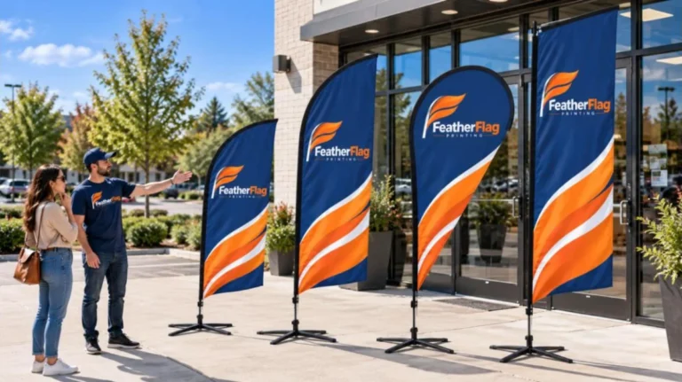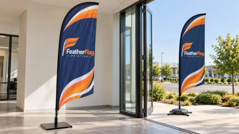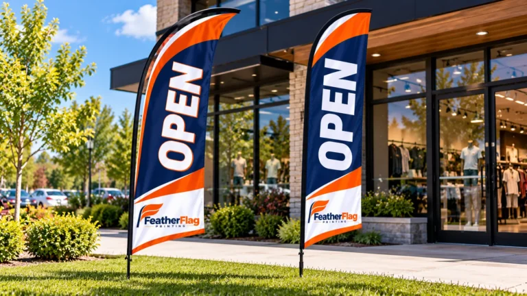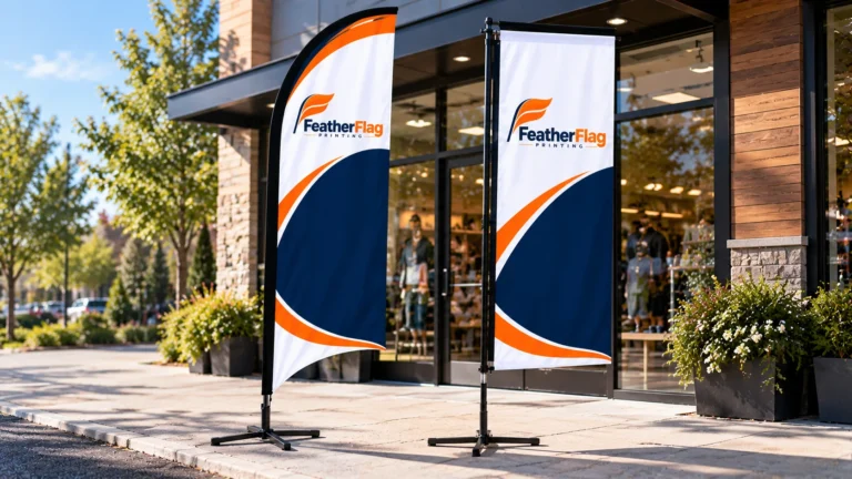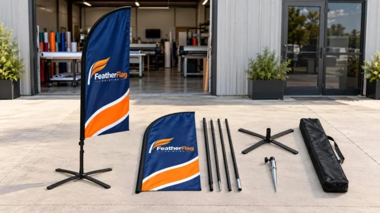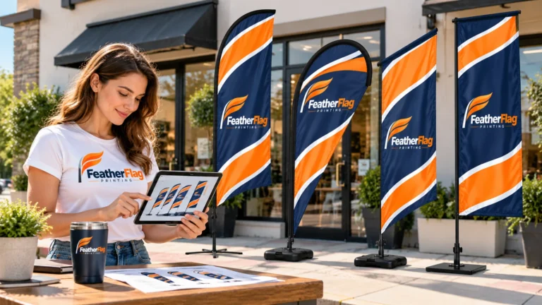
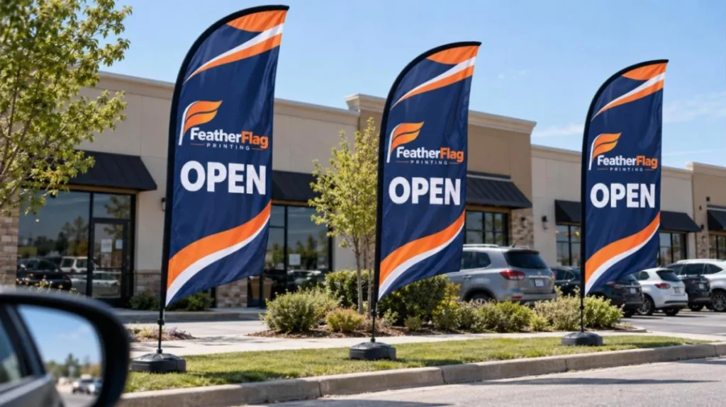
A feather flag is built to get noticed in busy outdoor spaces. Its fabric moves with the airflow, creating visual activity that can draw attention from passing drivers and pedestrians.
But movement is only the beginning. Once someone looks toward the flag, the message needs to be clear and easy to understand. Text size, message length, color contrast, viewing distance, placement, and the flag’s construction all work together to determine how effectively it communicates.
What Makes Feather Flags Effective?
Three elements have the biggest impact on how a feather flag gets noticed: movement, readability, and construction.
The moving fabric can attract attention, while large and simple lettering helps people understand the message quickly. Strong contrast separates the message from the background, and the curved structure allows the fabric to move naturally with the airflow.
In simple terms, movement gets attention, clear design communicates the message, and proper construction supports both.
Movement Gets the First Look
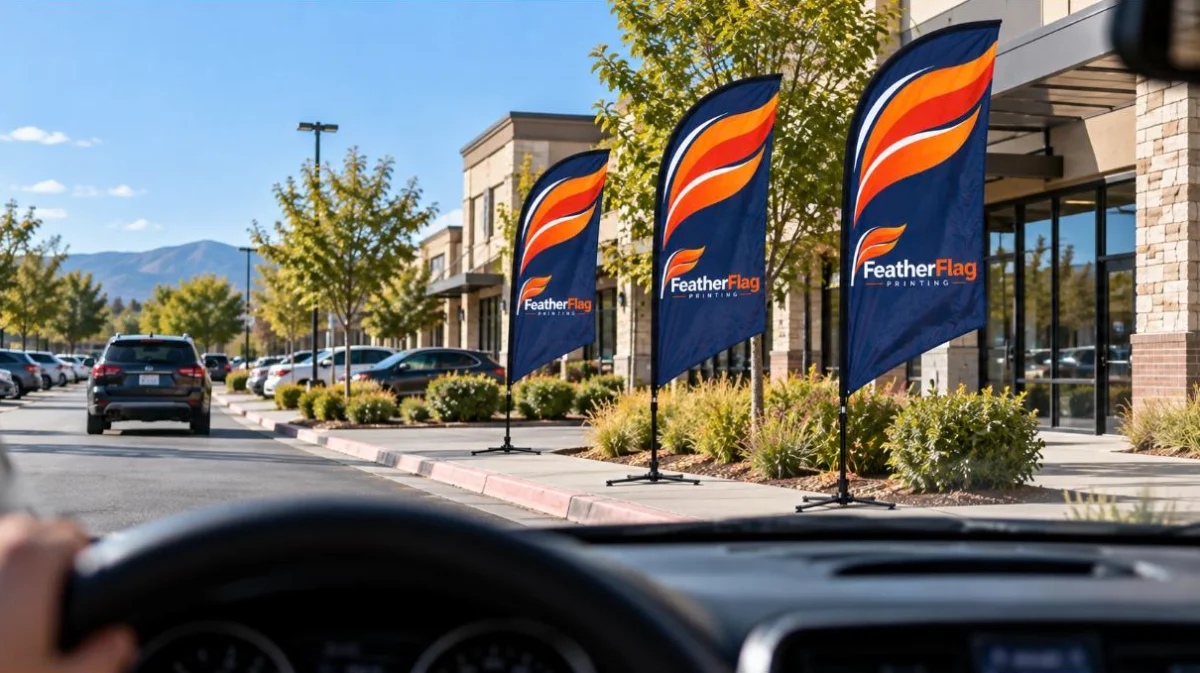
One of the biggest differences between a feather flag and a static sign is the movement of the fabric. As the flag sways with the airflow, its changing position creates visual activity that can attract attention.
This can be especially helpful in busy areas with vehicles, storefronts, signs, and other stationary objects. A moving flag adds something different to the surrounding environment and can encourage people to look in its direction.
However, getting noticed is only the first step. Once the flag catches someone’s attention, the message needs to be simple enough to understand quickly. That makes text size, contrast, and wording just as important as movement.
A Few Seconds to Make an Impression
People passing a roadside display do not have unlimited time to read it. Roadside signage is often planned around a three to five second viewing window, roughly what a driver gets when passing at around 45 mph.
That short viewing period puts a practical limit on how much information a feather flag can communicate.
A driver cannot stop and study several lines of text while passing. Even pedestrians may only glance at a flag while entering a business or walking through a busy area.
For this reason, the main message should be understood quickly. A feather flag works best when it communicates one clear idea instead of asking people to stop and read.
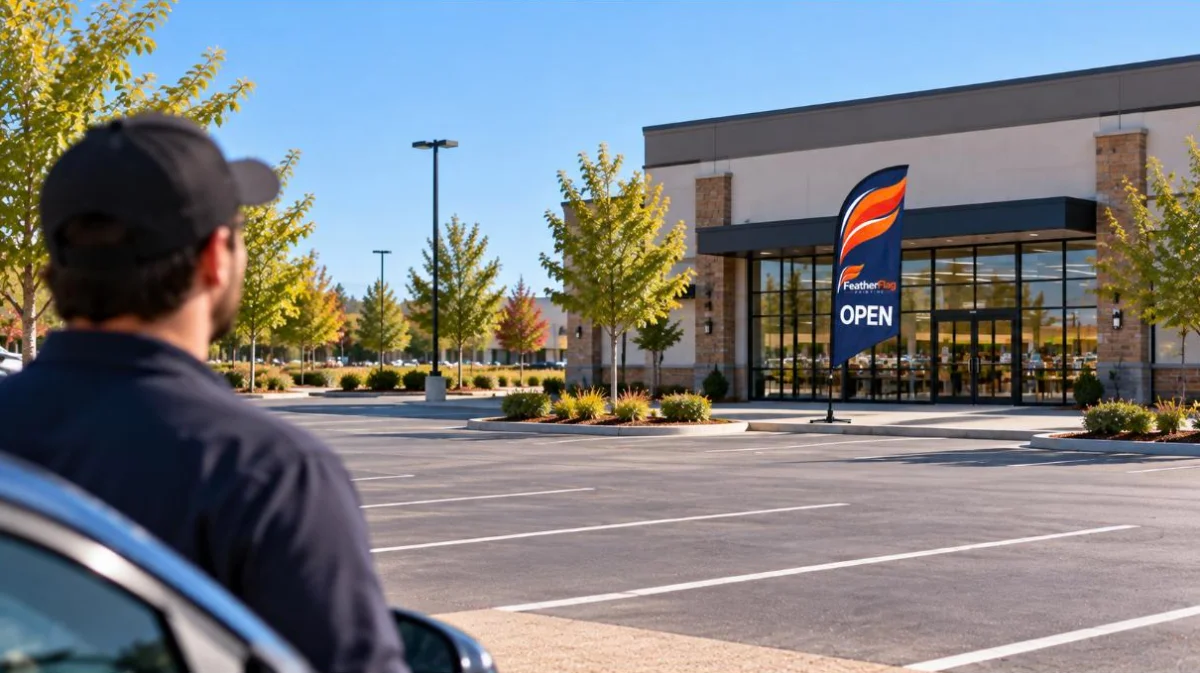
The Math Behind Readable Text
Text size and viewing distance are closely connected. A common sign industry rule of thumb is the 1:10 visibility ratio: roughly one inch of letter height for every ten feet of viewing distance.
For example:
| Letter Height | Approximate Viewing Distance |
|---|---|
| 1 inch | 10 feet |
| 10 inches | 100 feet |
| 20 inches | 200 feet |
| 30 inches | 300 feet |
On a standard 2.5 foot wide feather flag, a short four or five letter word can potentially be sized around 35 to 45 inches tall, giving an approximate viewing range of 350 to 450 feet under suitable conditions.
This is a practical guideline, not a guarantee. Font style, contrast, lighting, viewing angle, movement, and the surrounding environment can all affect actual readability.
The simple takeaway is this: the greater the viewing distance, the more important text size becomes.
Why Short Messages Work
The connection between viewing time and text size explains why short messages work so well on feather flags.
Trying to fit ten words onto a flag means giving less space to each word. The lettering becomes smaller, while the viewer has more information to process.
A message such as SALE, OPEN HOUSE, or OIL CHANGE can be displayed much larger and understood more quickly.
More detailed information can be provided through an entrance sign, storefront display, website, or other marketing material. The feather flag can focus on the message that encourages someone to take notice and move closer.
Contrast Makes the Message Clear
Large text can still be difficult to read if it blends into the background.
Strong color contrast creates a clear difference between the message and the fabric, helping the lettering stand out from a distance. Common high contrast combinations include blue and yellow, red and white, and blue and red.
There is no single color combination that works for every design. The important thing is to make sure the lettering clearly separates from its background.
A design that looks good on a bright computer screen may also look different outdoors. Light text on a light background or dark text on a dark background can lose clarity, especially in bright sunlight.
For an outdoor feather flag, clear readability should always come before subtle color choices.
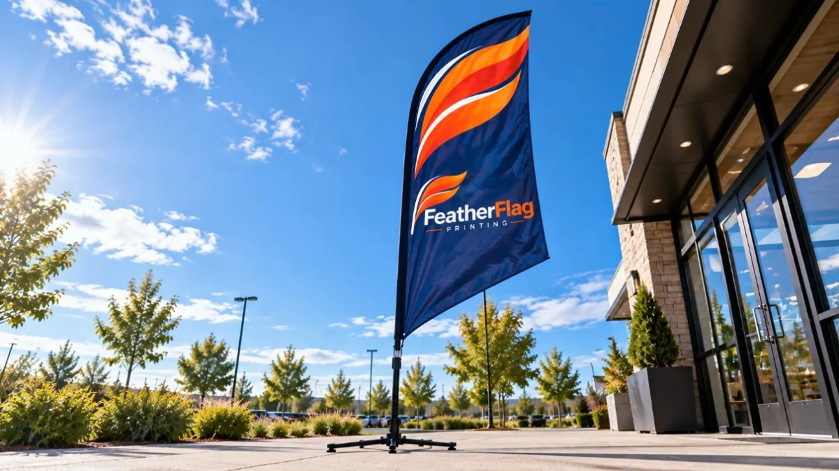
The Shape Helps Create the Movement
The curved profile of a feather flag is more than a visual feature. Its construction allows the fabric to move with airflow while maintaining its distinctive shape.
Some manufacturers use fabric that is slightly shorter than the supporting pole. For example, a 12 foot tall flag on a 15 foot pole leaves extra pole length, allowing the fabric room to move and flutter rather than remaining completely tight.
The structure also affects artwork placement. A sleeve usually runs along one edge of the flag to hold the supporting pole. Important information placed too close to this area may become harder to see as the fabric moves or may be affected during production.
The shape therefore influences both how the flag moves and where your message should be placed.